
Maybe DSW shoes is a Wisconsin thing, because it seems like I’m obsessed with it while no one else here in Miami has even heard of it. I get most of my shoes there, because they have awesome styles at affordable prices (and my mom always seems to have a coupon). Those “Valentino” stilettos? BCBG, $50, but I always get compliments on them because people think they were $1,000+.
#winning
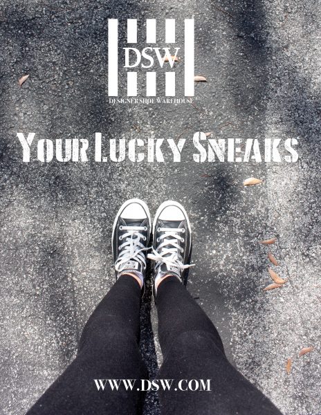
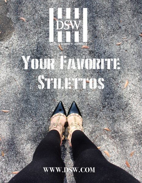
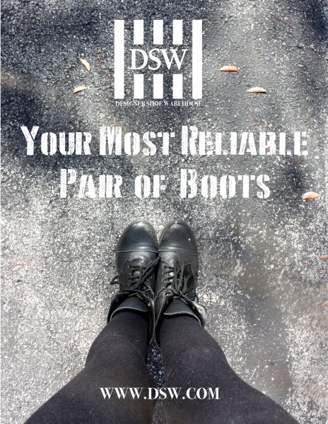
This ad campaign was, again, a project for my ART291 class. We were supposed to pick a local brand and create a 3-page magazine spread with a consistent theme and style. There were actually a ton of requirements for this project. We had to take our own photographs, as well as utilize “graffiti” and “grunge” styles. I always think short and sweet is best, so I knew I wanted to use an everyday view of the shoes, the DSW logo, and as a “call-to-action” I was just going to use their website. I figured this fit with the brand because they do offer online sales, but most of their income comes from in-store buys. The company also has a “buy online, pickup in-store” system that allows the customer to try on their shoes before taking them home for good.
My favorite part of this ad campaign was the perspective. I tried to make the entire campaign feel natural by taking the pictures in slightly different spots on the pavement, allowing the leaves to settle naturally on the ground, and maintaining a consistent color scheme between each pair of shoes. I feel like everyone looks down at their shoes, quite often actually, but brands rarely advertise the product like that. Activists and artists even use street graffiti to reach their target audience for this exact reason. Instagram pictures of a motivational quote at one’s feet are a staple of every white girl’s feed, so why not bring that into print advertising? The company and the perspective I wanted to express even worked well with the graffiti and grunge style that was required.