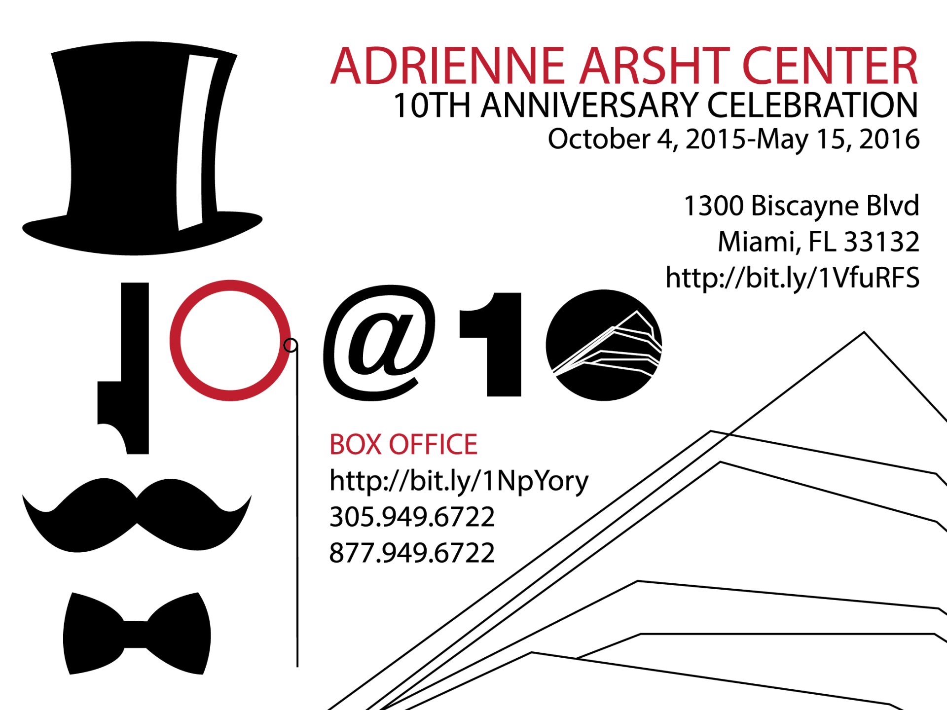
I’ve lived in Miami for five years, but I still have yet to attend a performance at the Adrienne Arsht Center. That doesn’t mean I’ve never heard of it before, however. For my ART291 class at UM, in an effort to teach us to be scalable, we were assigned a “macro” project where we designed a palm card, a poster, and a billboard for the Arsht Center’s 10th anniversary events. All three pieces were supposed to fit together as an ad campaign while being different enough to not look repetitive. I also wanted to make sure I was incorporating the logo for the event and all necessary information, while targeting the clientele most likely to be a patron of the arts. Following these guidelines, I created this ad campaign:
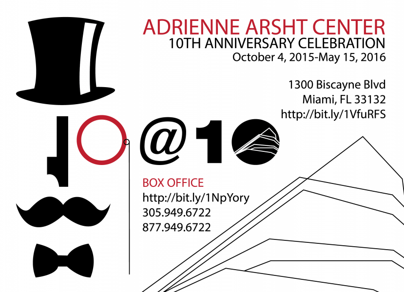
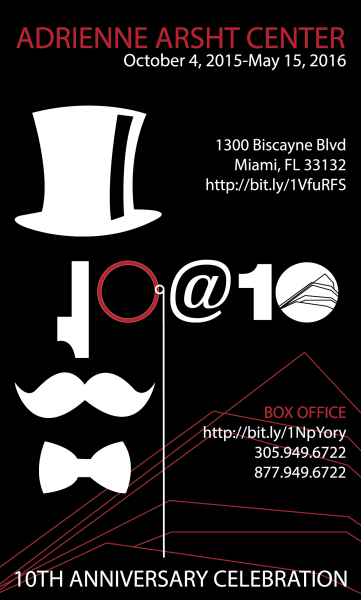
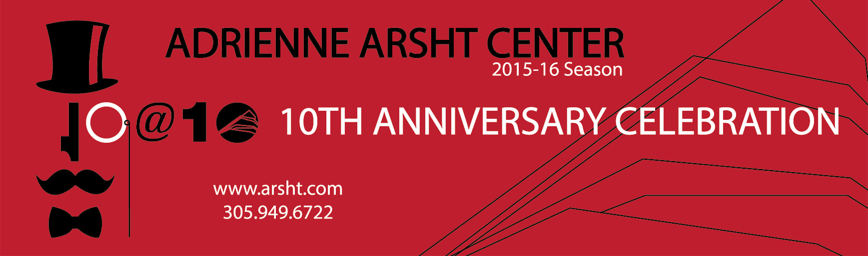
I particularly like my use of the “1” as a nose for my Monopoly Man! I tried to create an iconic pictoral representation of the audience I would be targeting, while still using typography in an interesting (but not confusing) way. I think I succeeded, because I still really like this series, even after months without looking at it. For the billboard, I tried to incorporate a lot less text so that passersby would easily be able to identify and remember the important information.