I clearly had an aquatic theme going for me in ART291. Shortly after creating my shark logo, we were assigned to create a cohesive piece of typographic art representing an oxymoron. I chose “flying fish,” but the flying part isn’t worth posting – the fish is the really special part.


I particularly love this post because I am able to show you the thought process I went through in my sketchbook before settling on the final design. I knew the shape I wanted and generally how it was supposed to look, but as you can see the fins on the S and filling in the third bubble to dot the I were added later, in Illustrator. Sketching the design out beforehand actually made it a lot easier to trace in Illustrator, and is still a technique that I (and probably every other designer) use quite often. It’s much easier and faster to manipulate shapes or even try again altogether on paper than it is on the computer.
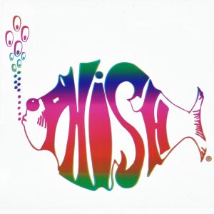
This is also a really great example of parallel thinking, or being accidentally inspired by another work of art. I knew this concept was familiar to me, but I couldn’t put my finger on exactly why until my in-class review. A classmate told me it reminded them of the “Phish,” the band, logo, which honestly it does! I personally think my version is cuter, I made it more in an angelfish style than the band’s tuna-looking one. ? I also think mine is easier to read and better uses the letter shape (of the F and H) as a part of the fish design. But for inspiration’s sake, take a look at the band’s version (the original version):