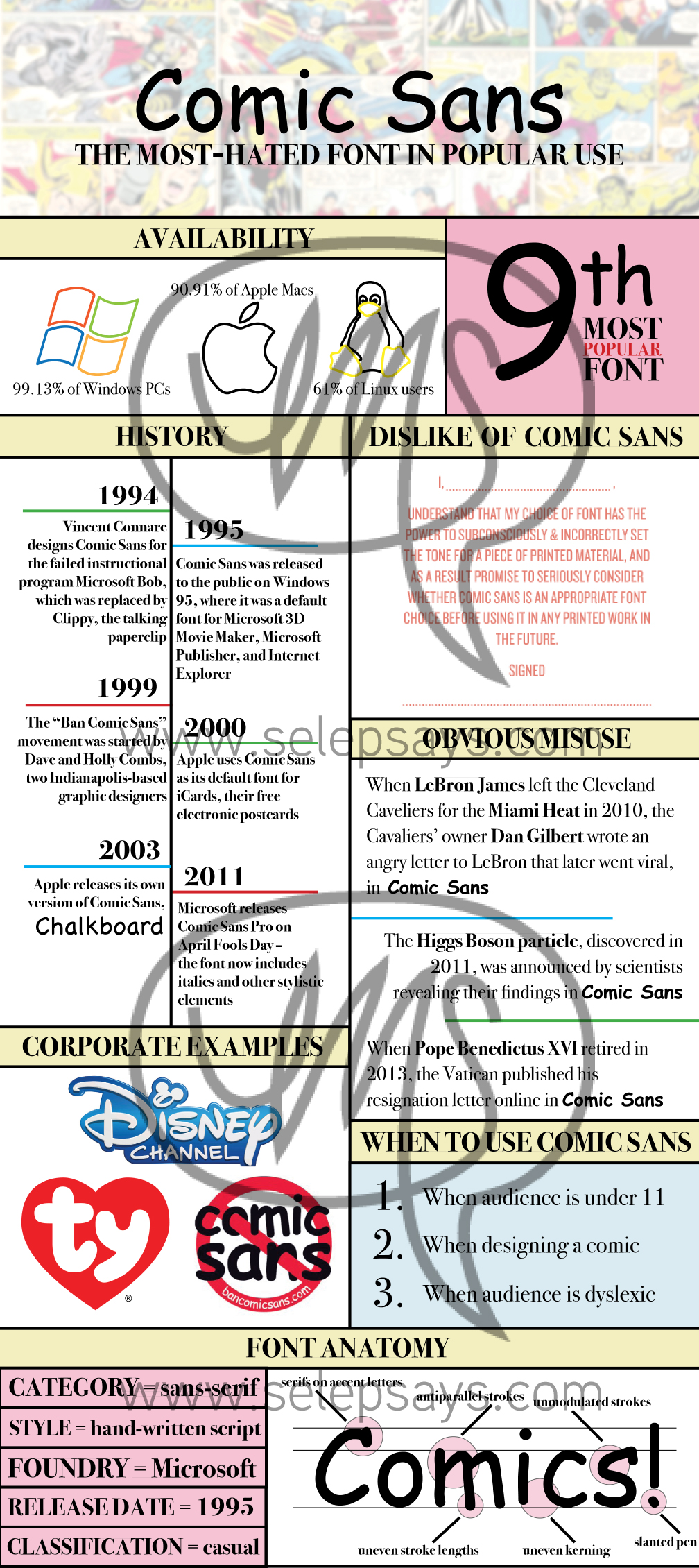
I’ve done several infographics over the course of my graphic design career (see my Legal Advertising Infographic), but I definitely had the most fun with this one. It was an assignment for my ART291 class at UM where we were required to create a fun infographic explaining a famous font.
I feel like this might be a recurring theme, but for most of these everyone-does-the-same-thing projects I absolutely rebelled and tried to do something no one else was doing. While my classmates were researching and creating infographics about Helvetica, Arial, Times New Roman, all of those boring fonts, I chose instead to focus on Comic Sans, the most obnoxious font ever. I KNEW I would have more fun this way, and with my science background I genuinely like researching new things. A lot of my classmates did Helvetica because the examples shown in class by my teacher were about Helvetica – they literally just stole and redesigned the information given to them as an example… whereas I used 11 sources. What can I say, I like this stuff 🙂


