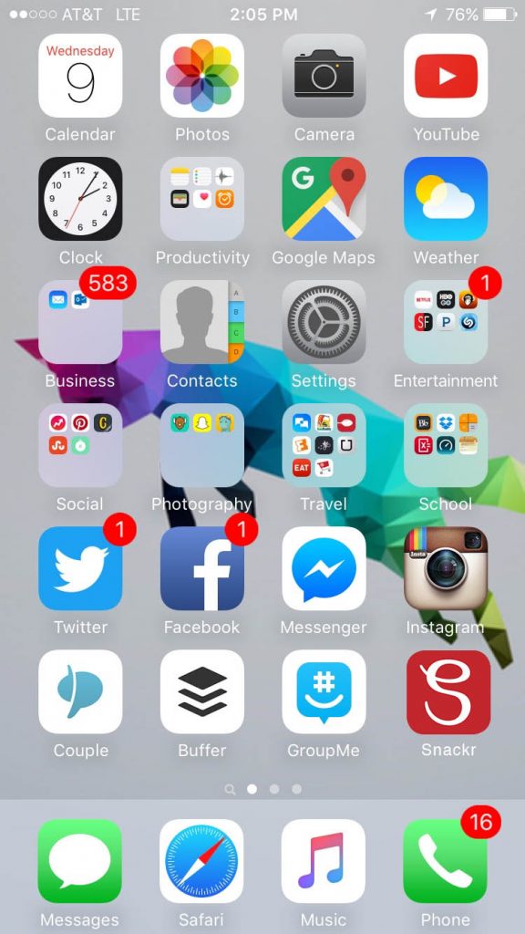
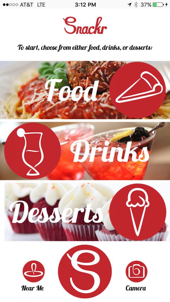
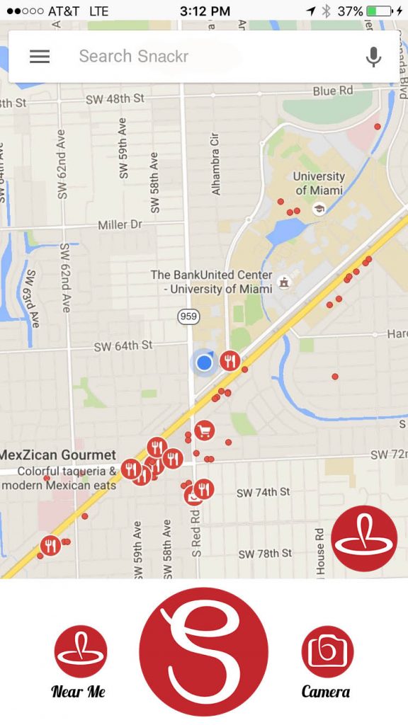
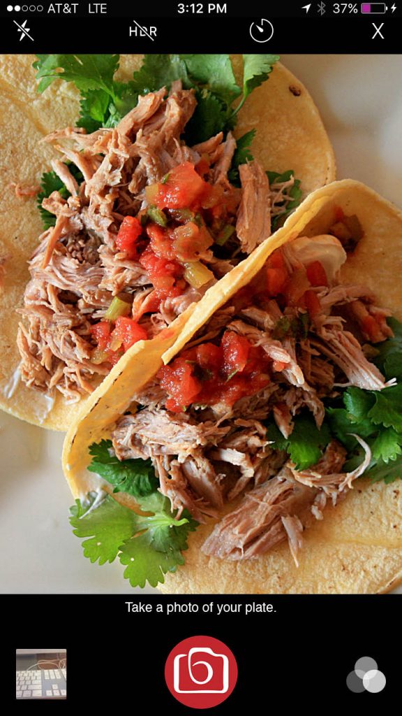
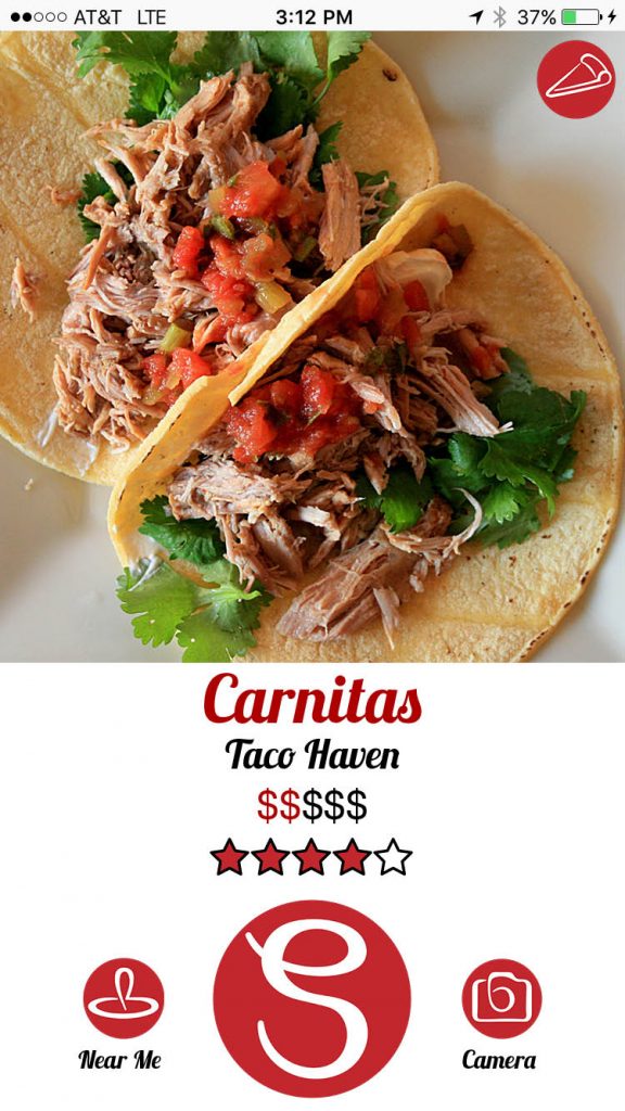
This is the most beautiful and cleanest app design that I have ever created, and it was actually relatively easy! Once I put in the grunt work of creating each of the icons (6 total: the logo, pizza, cocktail, ice cream, location, and camera), putting everything together into a cohesive and working design was simple.
My friend Jeff Kaminski originally came up with the idea of Snackr, which is actually a real, functioning business and app available on iTunes. It’s essentially Tinder for food – swipe right if you like what you see, swipe left if you don’t, swipe up for more information (phone number, address, etc). I thought it was a genius startup idea, so when in ART109 we were instructed to create a clickable, working app I knew what concept I would choose. Jeff’s app was already on the App Store when I made this, so my designs were not actually used, but it was really cool to make an ideal app interface for something that already exists. I got to see how the app actually works and recreate the design in a way I preferred. What do you think?
