Fish are friends, not food.
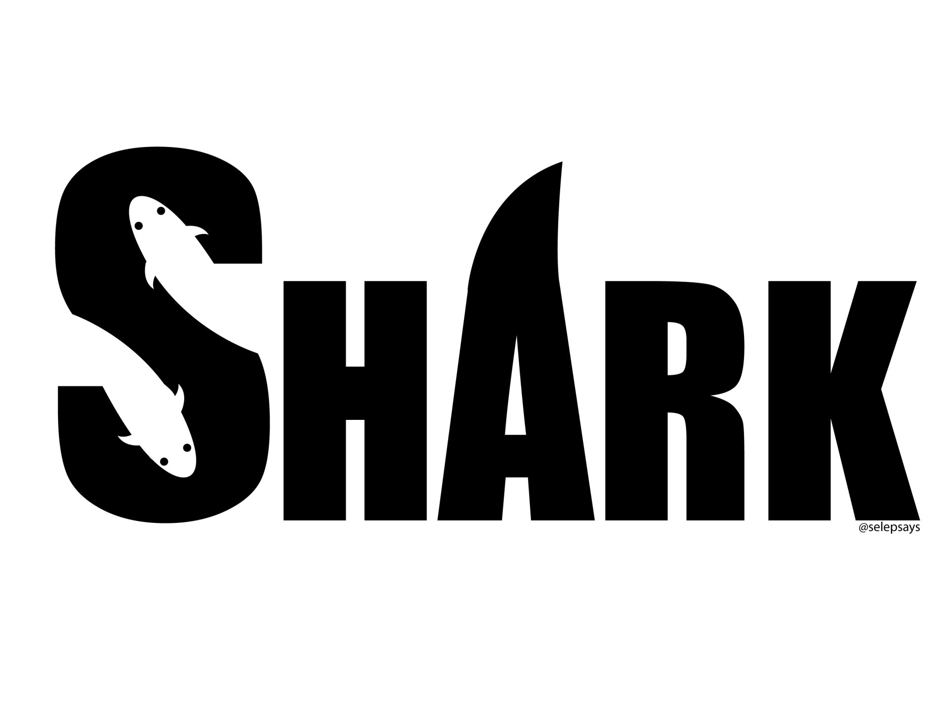
I absolutely love this piece for its simplicity and creativity. For my ART291 class at UM we focused a lot on typography, and one of our first assignments was to utilize negative space in the production of a logo. I was inspired by a former employer’s logo, which I thought could be improved. Eventually the project took a life of its own when I realized my employer was not ready to change their logo, and I could get a better grade on the project I was assigned by tweaking the original design. I changed the word and the theme, and added the shark fin to the A to add symmetry and fluidity. Now, even after graduating, this remains one of my favorite pieces.


